Kaba presents its new corporate identity program
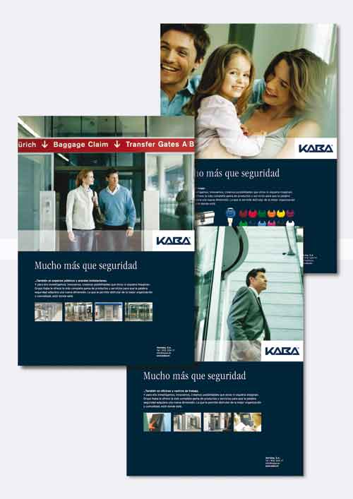
In this way, the design work has focused, especially in the study of the different applications - Workbench to depictions of everyday moments that are a reflection of tranquility and security while the Kaba logo has been reduced to pure typographic constructionfree of any aesthetic ornament, and has been promoted the use of the blue, the colour of harmony, loyalty and intellectual qualities, such as corporate colour. All this in an attempt to support the motto that has governed until today the Kaba group activity: more than just security.
"It was - in the words of the team responsible for the project-submit, on the one hand, the values that have grown this company: service, innovation, standardized solidez , i.e., to present us with a single face and a voice." "And, on the other hand, make this presentation with a visual language closer to the general public, and strengthen direct contact with the consumer and end user as well."


")